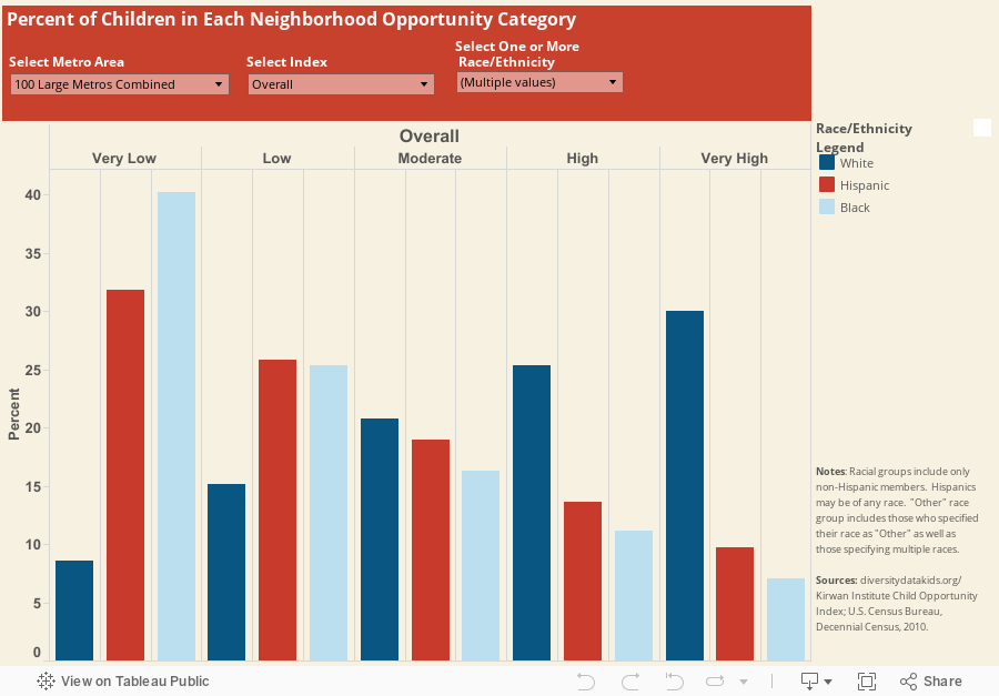
Use the interactive visualization below to examine the percent of children who live across neighborhoods with different opportunity levels within their metropolitan area (or for the 100 largest metropolitan areas combined). Select one or multiple racial/ethnic groups for comparison. You can also specify the Overall Child Opportunity Index, which combines 19 indicators of neighborhood opportunity, or one of three specific sub-indices reflecting educational, health & environmental, or socioeconomic opportunity. For more information on the construction of the indices and the underlying indicators, see the Technical Documentation.
Within each metro area, one fifth of neighborhoods (20%) are grouped into each of five opportunity levels (very low, low, moderate, high, and very high). Because neighborhoods (defined as census tracts) are roughly the same size in terms of population, if there was an equal or even distribution, we would expect that roughly 20% of children of each racial/ethnic group would live in neighborhoods of each opportunity level. However, the actual distribution of children is starkly different from this hypothetical uniform distribution, highlighting the nature and extent of the inequities between children of different racial/ethnic groups in accessing neighborhood opportunity.
Further explore the geography of opportunity for each of the 100 largest metro areas with this interactive mapping tool and by reading our new report: The Child Opportunity Index: Measuring and mapping neighborhood-based opportunities for U.S. Children.